
Brief
The project was to conceptualize a children's park with points-of-distinction that would make it unique. Within a team of four designers, each would have to create marks to symbolize the park and these points-of-distinctions. Each person would create business and collateral system to represent the brand as well. The park would be set at the location of Fantasy Land in Sacramento, California.
The team conceptualized a park that had an artificial beach during the summer and a winter wonderland that features an ice rink in the winter. The park would feature a reward system where parents can earn points for a free birthday party for their children when they found hidden pictures of the park mascot throughout the park.
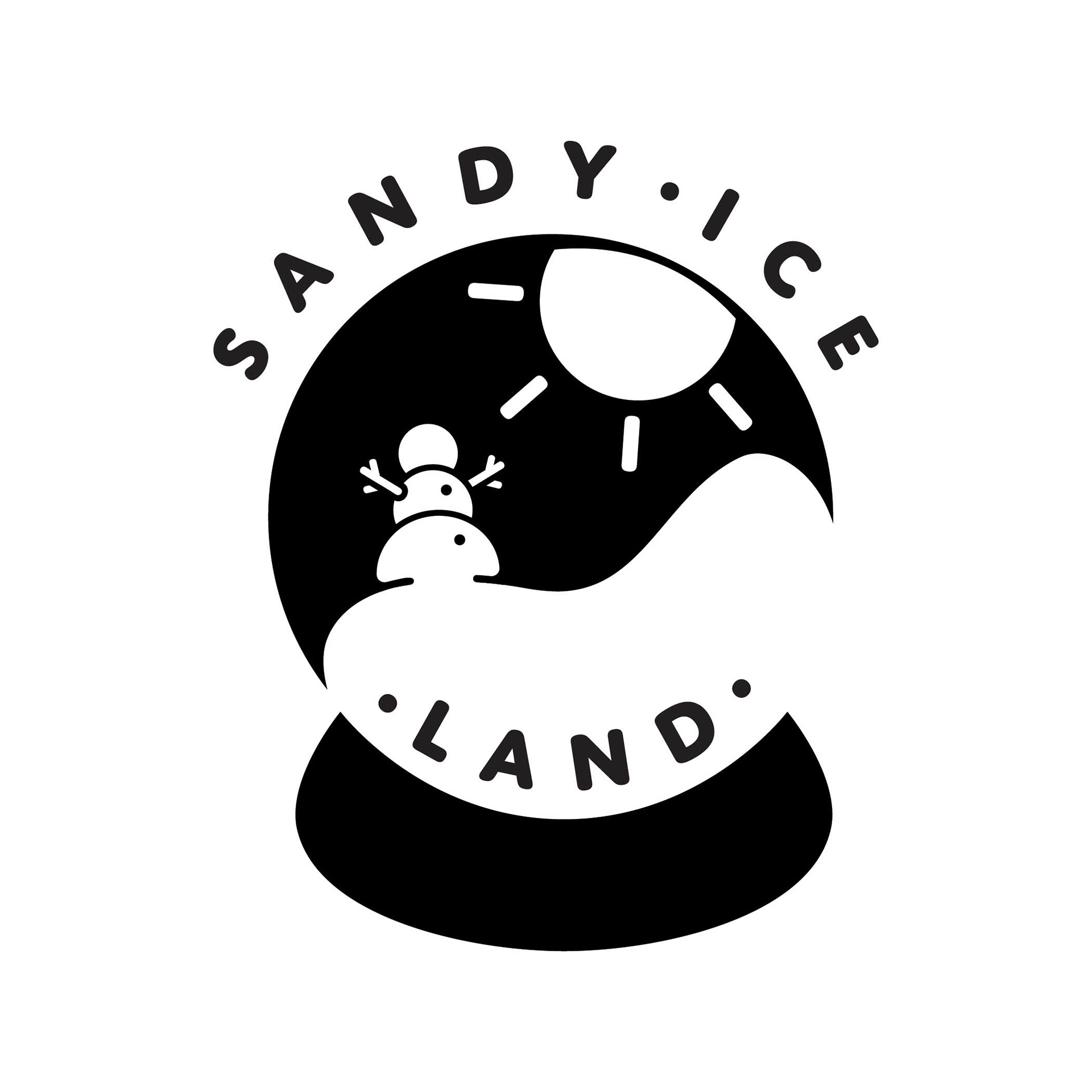
Sandy Ice Land Logo
The logo is based on the parks main point-of-distinction, which was the beach in the summer and winter wonderland. The snow globe pays an homage to the architecture of the park, which has a glass exterior. Inside the globe, a snow man basks in the sun. Negative space carves out the snow which also makes the stand of the snow globe.
The blue and orange bring both elements of winter and summer while the coral pink brings an element of energy and passion. Bringing all these colors together, creates a fun and energetic environment for the children.
Black & White Logo
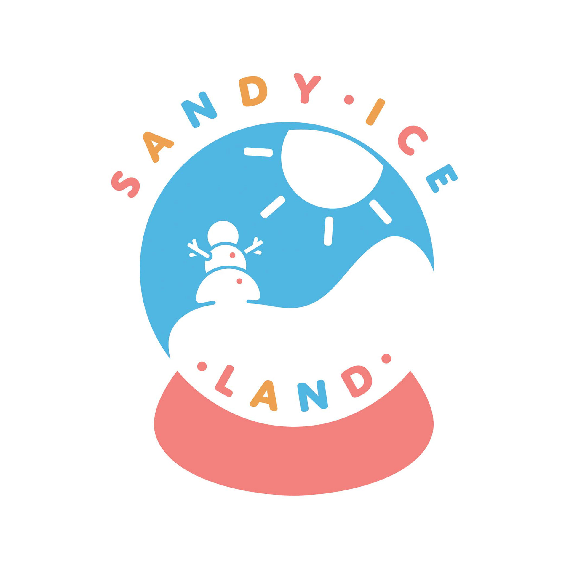
Colorized Logo
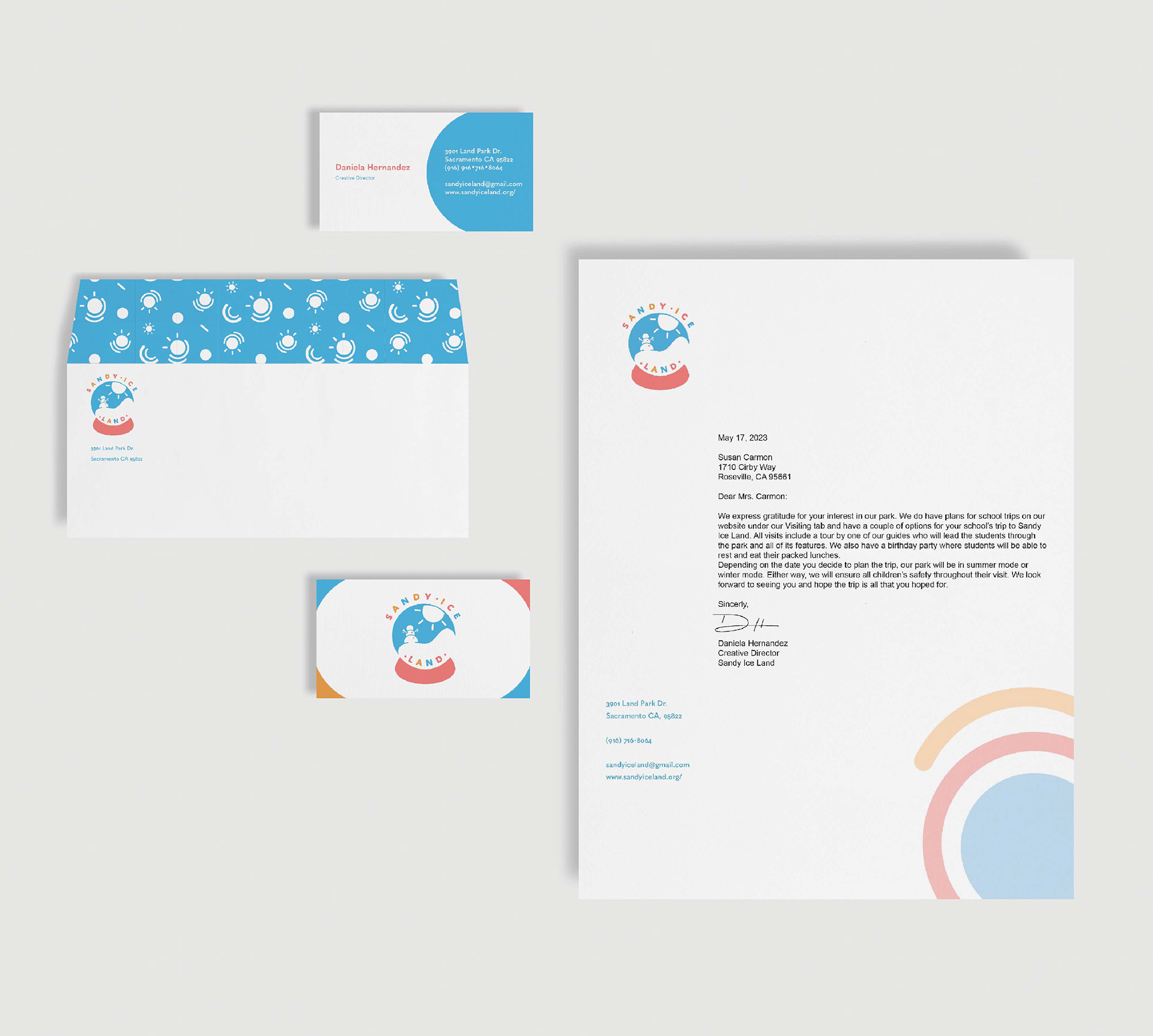
Business System
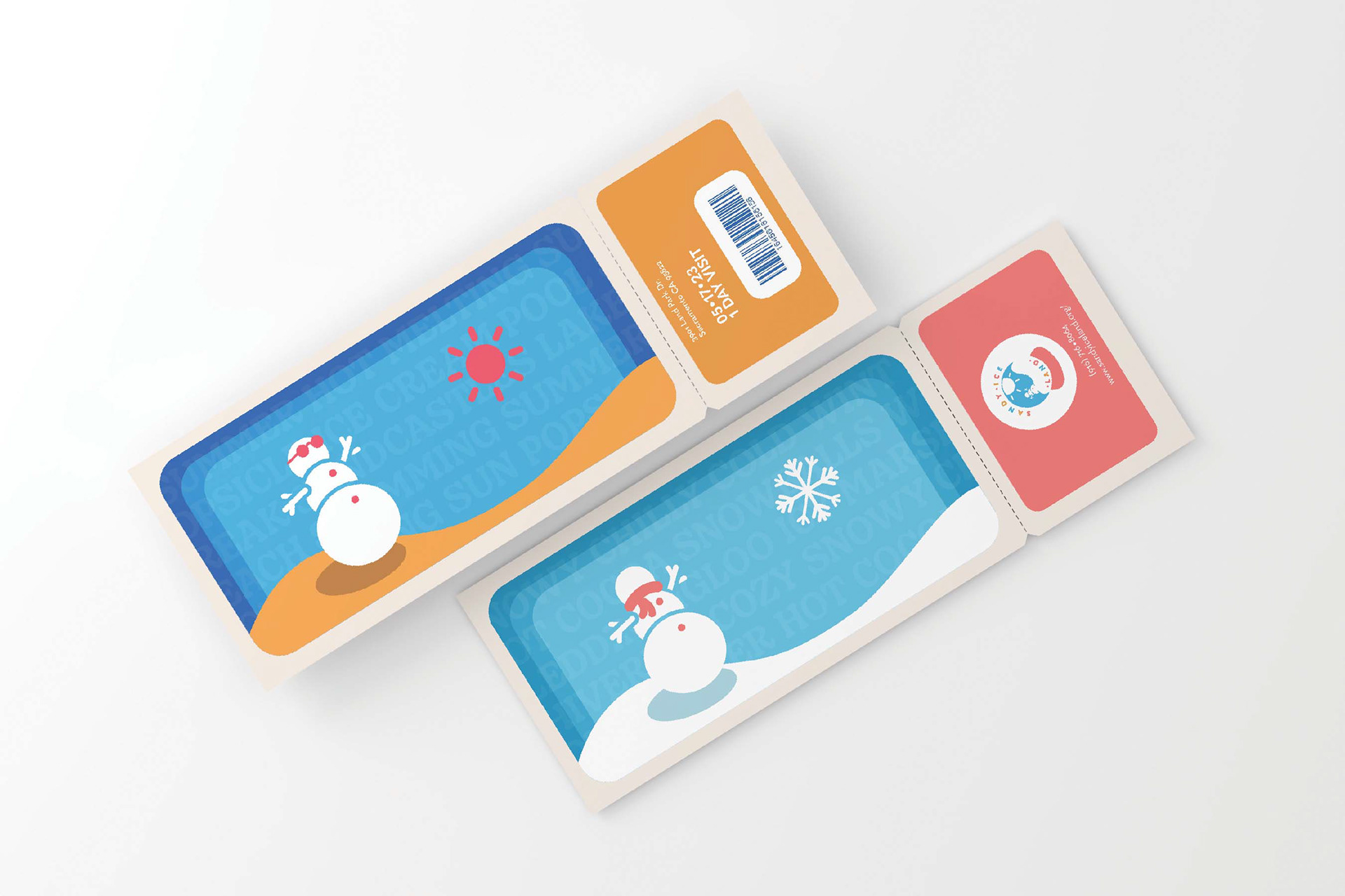
Entry Ticket
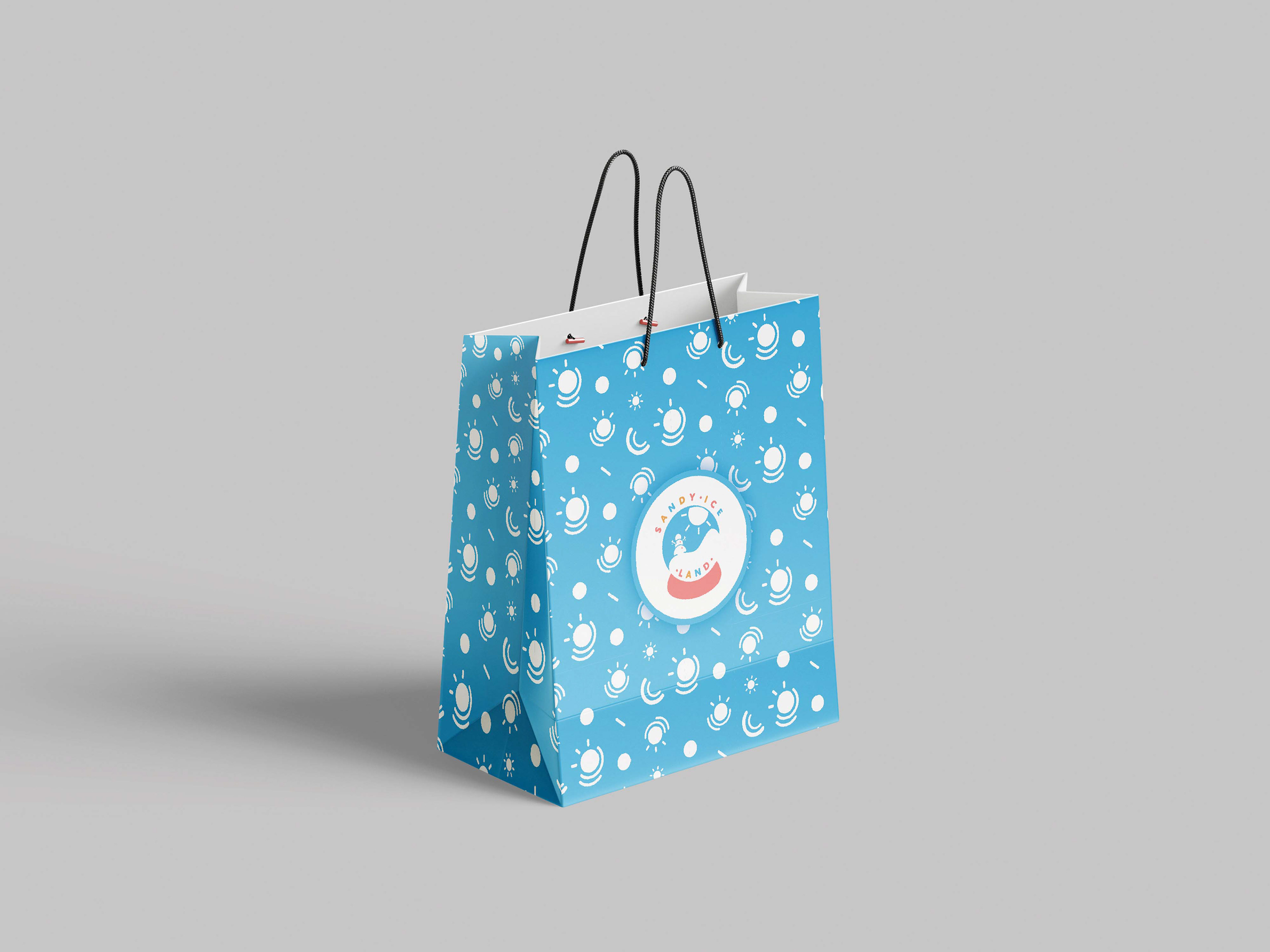
Gift Bag